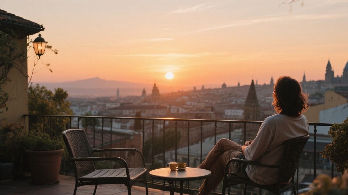
I didn't edit my travel photos for the first two years I was serious about photography. I believed that getting the image right in the camera was the whole point, and that editing was a form of cheating. Then a professional photographer I met at a hostel in Hanoi looked at my RAW files on my laptop and said, 'These are good, but they're flat. You're throwing away half the information your camera captured.' He opened Lightroom, spent five minutes adjusting the contrast, the white balance, and the color grading on one of my images, and the transformation was dramatic — not in a fake, over-processed way, but in a way that made the image look the way the scene actually felt when I was standing there. That was the moment I understood that editing isn't about fixing bad photos — it's about realizing the potential of good ones.
Choosing Your Editing Software
The three most widely used photo editing programs for travel photographers are Adobe Lightroom, Capture One, and DxO PhotoLab. I've used all three extensively, and each has strengths and weaknesses. Lightroom ($10 per month as part of the Photography plan, which also includes Photoshop) is the most popular choice, and for good reason — its catalog system is excellent for managing large photo libraries, its editing tools are powerful and intuitive, its mobile app allows you to edit on your phone or tablet, and its integration with Photoshop provides a Smooth workflow for more advanced editing. The subscription model is a drawback for some photographers, but the value is hard to argue with.
Capture One ($180 for a perpetual license, or $15 per month for a subscription) produces slightly better image quality from RAW files, particularly in terms of color rendering and noise reduction. Its color editing tools are more sophisticated than Lightroom's, and it handles files from Fujifilm cameras particularly well (Fujifilm users often prefer Capture One for this reason). The catalog system is less intuitive than Lightroom's, and the learning curve is steeper, but the image quality advantage is real. DxO PhotoLab ($140 for a perpetual license) has the best noise reduction and lens correction of any software I've tested — its DeepPRIME XD noise reduction can produce clean images at ISO 12,800 that other software can't match. DxO's editing tools are less Complete than Lightroom's or Capture One's, but for photographers who shoot in low light, the noise reduction alone may justify the price.
For free alternatives, Darktable (darktable.org) is an open-source RAW processor that provides many of the same tools as Lightroom, including a catalog system, non-destructive editing, and a wide range of adjustment tools. The interface is less polished than Lightroom's, and the learning curve is steep, but the price is right. RawTherapee (rawtherapee.com) is another free option with strong color management and detail Improve tools. Both Darktable and RawTherapee are capable of producing professional-quality results, but they require more time and effort to learn than the commercial alternatives.
The Editing Workflow I Use for Every Image
I follow the same basic workflow for every travel photo I edit, and the consistency of this workflow is what allows me to process images quickly without sacrificing quality. The workflow has seven steps: import and cull, lens correction, crop and straighten, exposure and contrast, color correction, color grading, and export. Each step builds on the previous one, and the order matters — correcting the lens distortion before cropping, for example, ensures that the crop is applied to the corrected image rather than the distorted one.
First, one is culling, which I do immediately after importing. I go through the day's images in Lightroom's survey mode, flagging only the ones that genuinely excite me. From a typical day of shooting — 200 to 400 frames — I'll flag 20 to 30. From those, I'll select 5 to 10 for full editing. This aggressive culling is the single most important step in my workflow, because it means I spend my editing time on the images with the most potential rather than wasting time trying to rescue mediocre shots. If I'm unsure about an image, I don't flag it — the maybe pile is where good editing goes to die.
First, two is lens correction. Every lens, even expensive ones, produces some degree of distortion — barrel distortion in wide-angle shots, pincushion distortion in telephoto shots, and chromatic aberration (color fringing) at high-contrast edges. Lightroom's lens correction profiles automatically correct for these issues based on the specific lens and camera body you used. I check the 'Enable Profile Corrections' box and the 'Remove Chromatic Aberration' box for every image. This step takes about five seconds and produces a noticeably cleaner image, particularly at the edges of the frame.
First, three is crop and straighten. I crop to improve composition, removing distracting elements at the edges of the frame and adjusting the aspect ratio to suit the image. I also straighten the horizon if it's tilted — Lightroom's auto-straighten tool usually gets this right with one click. I crop conservatively, removing no more than 10 to 15 percent of the frame in most cases. Heavy cropping reduces resolution and image quality, and if I need to crop more than 20 percent, the image probably wasn't composed well enough in the camera.
Exposure, Contrast, and Color Correction
Step four is exposure and contrast adjustment. I start with the histogram — the distribution of tones from dark to light across the image. A well-exposed image typically has a histogram that stretches across most of the tonal range without clipping (cutting off) at either end. If the histogram is bunched to the left, the image is underexposed; if it's bunched to the right, it's overexposed. I adjust the exposure slider to center the histogram, then fine-tune with the highlights, shadows, whites, and blacks sliders. The goal is to recover detail in the highlights (bright areas) and shadows (dark areas) without making the image look flat or artificial.
Contrast is the difference between the lightest and darkest tones in the image, and it's what gives a photo depth and dimension. I add contrast using the tone curve rather than the contrast slider, because the tone curve gives me more precise control. A gentle S-curve — darkening the shadows slightly and brightening the highlights slightly — adds contrast in a way that looks natural. I also use the clarity slider (which increases midtone contrast) sparingly — a setting of plus 5 to plus 15 adds definition without making the image look harsh. The dehaze slider, which cuts through atmospheric haze, is useful for Scene photos taken in humid or dusty conditions, but I keep it below plus 15 to avoid an unnatural look.
Step five is color correction, which means getting the colors in the image to match what I actually saw. White balance is the starting point — I set it using the temperature and tint sliders, or by clicking on a neutral gray area of the image with the white balance eyedropper. If the image was shot in RAW format (which I always do), the white balance can be adjusted without any quality loss. After setting the white balance, I fine-tune individual colors using the HSL (Hue, Saturation, Luminance) panel. I typically increase the saturation of warm colors (oranges, yellows, reds) slightly and decrease the saturation of cool colors (blues, cyans) slightly, which gives travel photos a warm, inviting quality that matches the way we remember sunny destinations.
Color Grading: Creating a Consistent Style
Color grading — the deliberate manipulation of colors for aesthetic effect — is what gives a travel photographer's work a recognizable, consistent style. My color grading approach is subtle: I use the split toning panel (in Lightroom) or the color grading panel (in Lightroom's updated interface) to add a warm tone to the highlights and a cool tone to the shadows. This creates a slight color contrast across the tonal range that gives images a cinematic quality. I use a highlight color of around 15 on the orange-yellow axis and a shadow color of around 10 on the blue-teal axis, with a saturation of 5 to 10 percent. The effect is subtle — most viewers wouldn't consciously notice it — but it gives my images a consistent look that ties my portfolio together.
I've created a set of Lightroom presets that apply my standard color grading along with my typical exposure, contrast, and sharpening settings. The preset serves as a starting point for every image, and I adjust individual settings from there. Having a preset doesn't mean every image looks the same — it means every image starts from a consistent baseline, which saves time and ensures visual coherence across a set of photos from the same trip. I've created different presets for different lighting conditions: one for golden hour (warm tones, slightly lifted shadows), one for overcast (cooler tones, slightly increased contrast), and one for indoor available light (warm tones, reduced highlights to control window light).
The most common mistake in color grading is overdoing it. Heavy color grading — deep teal shadows, orange skin tones, crushed blacks — looks trendy on Instagram but doesn't age well and can make travel photos look artificial. I've found that the most effective color grading is the kind that viewers don't consciously notice — it should Improve the mood of the image without calling attention to itself. If someone looks at your photo and says 'nice editing,' the editing is probably too heavy. If they say 'nice photo,' the editing has done its job.
Sharpening and Noise Reduction
Sharpening and noise reduction are the final technical adjustments I make before exporting. Sharpening increases the contrast at edges in the image, making details appear crisper. Lightroom's sharpening is applied in two stages: capture sharpening (which compensates for the softening inherent in digital sensors and anti-aliasing filters) and output sharpening (which optimizes the image for its intended display size). I set capture sharpening in the Detail panel: Amount 40, Radius 1.0, Detail 25, Masking 50. The masking setting is important — it restricts sharpening to edges and avoids sharpening noise in smooth areas like skies and skin. I hold down the Alt key (Option on Mac) while dragging the masking slider to see a black-and-white preview: white areas are sharpened, black areas are not.
Noise reduction is necessary for images shot at high ISO settings (above 1600 for most cameras), where digital noise becomes visible as grainy, colorful speckles in the shadows and midtones. Lightroom's noise reduction has two components: Luminance noise (the grainy pattern) and Color noise (the colored speckles). I set Color noise reduction to 25 and Luminance noise reduction to 10 to 20, depending on the ISO. The key is to reduce noise enough that it's not distracting without smoothing away fine detail. Over-aggressive noise reduction makes images look plasticky and artificial, particularly in areas like foliage, hair, and fabric textures. I zoom in to 100 percent when adjusting noise reduction to make sure the detail is preserved.
Output sharpening is applied during export and is optimized for the specific display size. In Lightroom's export dialog, I set output sharpening to 'Screen' for images destined for web display and 'Matte Paper' or 'Glossy Paper' for images destined for print. The sharpening amount is automatically calibrated for the export resolution. For web display, I export at 2048 pixels on the long edge (suitable for most websites and social media platforms) and 100 percent quality JPEG. For print, I export at the full resolution of the camera sensor (typically 6000 to 8000 pixels on the long edge) and convert to sRGB color space, which most print labs require.
Exporting and Organizing for the Web
How you export and organize your images for the web affects both their visual quality and their discoverability. I export web images at 2048 pixels on the long edge, which provides enough resolution for sharp display on most screens while keeping file sizes manageable (typically 300 to 800 KB per image). The sRGB color space is standard for web display — if you export in Adobe RGB or ProPhoto RGB, the colors will appear washed out or incorrect on browsers that don't support those color spaces. I convert to sRGB during export and embed the sRGB profile in the file.
File naming and metadata are important for organization and SEO. I name my files with a consistent format: destination_date_sequence (e.g., iceland_20240915_001.jpg). I add a title, caption, and keywords to every image in Lightroom's metadata panel before exporting — the keywords are particularly important for images that I upload to stock photography platforms or my own website, because they determine whether the image appears in search results. I use a keywording approach that starts with the broad category (Scene, portrait, street, food) and narrows to the specific (waterfall, sunset, Iceland, Seljalandsfoss).
For social media, I resize images to the specific dimensions recommended by each platform: 1080 by 1080 pixels for Instagram feed posts, 1920 by 1080 for YouTube thumbnails, 1200 by 628 for Facebook shared links. Each platform compresses images further on upload, so starting with a high-quality, correctly sized file produces the best results. I use a Lightroom export preset for each platform that automatically applies the correct dimensions and color space. This saves time and ensures consistency across my social media presence.